A metal sculptor turned UX Designer & UX researcher, turned product manager, now a Design Manager specializing in building Software Platforms that unify Product, Design & Strategy across Conversational AI, Enterprise SaaS, Fintech, IT Monitoring Services and Dealership Management Systems.
My journey spans from an artist to UI/UX Designer & Researcher at Zoho, a Product manager at PayPal, and a Design manager at Tekion and Uniphore.
Platform design, product strategy, and design leadership across enterprise-scale products.
When I joined PayPal's Risk & Compliance team in 2018, investigators were managing fraud detection, money laundering prevention, and regulatory compliance using Excel spreadsheets and juggling 6+ different applications per case. Over 18 months, I led the design and product strategy for three interconnected platforms that transformed how PayPal handled risk investigations globally.
PayPal processes millions of transactions daily. Every transaction flows through SINE (Scan Engine), a real-time risk screening system that flags potential money laundering, terrorist financing, sanctions violations, PEP matches, fraud, and policy violations. Flagged transactions become cases routed to one of 10+ specialized departments: PEP, SAR, AML, DD, EDD, CDD, ODD, BRM, Fraud, Underwriting, and Global Investigations.
The situation when I arrived:
The solution emerged as three interconnected platforms: SCM (Simplified Case Management) to unify investigation tools, HCP (Holistic Customer Profile) as a single source of truth for customer data, and CCI (Customer Centric Insights) to reorganize departments into persona-based teams with a modular widget platform.
August 2018. I joined as a Product Manager, though my background was in product design. Leadership specifically wanted someone who could bridge both disciplines. My first challenge: I knew nothing about payments, compliance, or risk operations. I spent my first two weeks just learning acronyms — chargebacks, OFAC, sanctions lists, false positive detection rates, KYC vs. CDD vs. EDD.
I could have faked expertise. Instead, I embraced being a beginner. I asked “stupid questions.” I took notes obsessively. I built a glossary. This beginner’s mindset became my superpower — I wasn’t constrained by “this is how we’ve always done it.”
Research methodology. I conducted extensive ethnographic research over 3 months: 30-40 investigator interviews across departments and seniority levels, multiple office locations, supervisor interviews, and full-shift shadowing sessions. Methods included contextual inquiry, task analysis, journey mapping, pain point identification, and cognitive load assessment — documented in Miro, Google Sheets, and screen recordings.
I created detailed journey maps for each department covering six phases (Case Assignment, Information Gathering, Analysis, Documentation, Approval/Escalation, Case Closure) — mapping actions, tools, time spent, pain points, emotional state, and failure points for each.
Key Research Findings
The Excel Nightmare. Every department managed cases in Excel spreadsheets passed around via email — not a shared database, not a ticketing system. A typical workflow: receive case email, open personal Excel tracker, log into Attack (copy transaction details), log into Admin (copy personal data), open Norkom (search risk flags), open World-Check (check against lists), manually compare, document in Excel, email supervisor, wait for response. For. Every. Single. Case.
Tool Fragmentation. Minimum 6 applications per case (Email, Excel, Attack, Admin, Norkom, World-Check) — some departments added LexisNexis, Dow Jones, and Google Maps for manual address verification. Each required separate login and different UI patterns. Average: ~50 clicks per case.
The Aha Moment. A senior investigator told me: “PayPal is one company, but we use sooooo many tools for investigation.” World-class engineering, billions in payments — yet investigators were copying data manually between 6 systems, spending more time on tooling than actual investigation.
Departmental Silos. No shared case visibility (PEP couldn’t see SAR’s flags). No communication protocols. Same user under review by 3 departments simultaneously without anyone knowing. Duplicated effort, inconsistent decisions, frustrated investigators — and the real victims were customers.
Leadership’s original vision was ambitious: build a case management platform so good that PayPal could offer it as a product to other companies. For that to work, we needed world-class UX, scalability, configurability, and intelligence. My strategy: start with one department (SAR) to prove the concept, earn trust through execution, expand iteratively, build modular reusable components, and think platform — not point solutions.
Design Principles
| Reduce Cognitive Load | Single-page case views. Progressive disclosure. Visual hierarchy guiding attention. |
| Eliminate Redundancy | Don’t make users find data that exists elsewhere. Automate what machines can do. Pre-fill with known info. |
| Contextual Intelligence | Surface relevant data by case type. Highlight anomalies. Decision support, not just information display. |
| Seamless Workflows | Approvals and escalations built in. No email back-and-forth. Clear next actions at every step. |
| Audit & Compliance | Every action logged. Full audit trail for regulators. Documentation templates for consistency. |
| Human-Centered | Designed for 8-hour shifts. Keyboard shortcuts. Customizable dashboards. WCAG compliant. |
Making UX Part of PDLC
One of my biggest battles. At PayPal, the traditional flow was: PM gathers requirements, engineering builds, designer comes in at the end to “make it pretty.” I pushed for a new model — Discovery (PM + Designer together), Definition (requirements WITH design input), Design (solutions validated with business), Validation (user testing BEFORE engineering builds), Development (designer stays involved), Launch (measure, learn, iterate).
Resistance was fierce. I won by leading with results — prototypes that demonstrated ROI, data that proved design impact, and a collaborative approach that made PMs and engineers co-owners. By the time we shipped PEP, UX was embedded in PDLC. Design reviews at every sprint. User testing non-negotiable. This cultural shift was as important as the products themselves.
We chose SAR as the pilot because it had the most complex workflow (if we could crack this, we could crack anything), high volume (hundreds of cases daily), critical compliance function (reports go to federal regulators), and engaged stakeholders.
I mapped every data point investigators needed and organized them into a hierarchical widget structure: a Primary Panel (always visible) with case header, transaction summary, and quick actions; and Secondary Panels (collapsible) for user profile, transaction details, risk indicators, related cases, external intelligence, investigation notes, evidence, and audit trail. Low-fi wireframes in Sketch, then moderated usability testing with 5 SAR investigators revealed key needs: keyboard shortcuts, color-coded priority, inline notes, drag-and-drop evidence attachment.
Key features shipped: single-page case view (no more tabbing between 6 apps), contextual collapsible widgets with drag-and-drop reorder, embedded Norkom/World-Check intelligence (auto-pulled on case open), inline rich-text notes with auto-save, smart actions (pre-filled dismiss templates, auto-populated info requests, one-click escalation), full audit trail, and dashboard with personal/team queues and filters. Built with React, Redux, RESTful APIs, SSO, encrypted data with no local storage.
Phase 2: PEP & The Google Maps Innovation
During shadowing, I noticed a tedious pattern: investigators would open a PEP case, pull the user’s address from Admin, pull the PEP hit address from World-Check, open Google Maps in a new tab, paste both, check the distance. If >500km, it’s a different person — case dismissed. This happened hundreds of times per day.
I proposed automating this with Google Maps API. Engineering pushed back (“nice-to-have,” “API costs money”). Instead of arguing, I built proof: a clickable InVision prototype with real anonymized data and functional Maps integration. A/B test with 20 PEP investigators, 50 cases each, 2 weeks. Results: 67% AHT reduction for distance-based dismissals, 22% of cases auto-dismissed, test group closed 40% more cases per day.
ROI: Investment: ~$15,000 (eng time) + $500/month (API). Return: ~500 cases/day × 3.5 min saved = 29 hours/day = $530,000/year savings. Payback period: 1 month. Approved immediately. Built in 2 weeks.
Phase 3: Scaling to Other Departments
With SAR and PEP proven, we rolled out SCM to DD, EDD, CDD, ODD, and BRM. Instead of building from scratch, I designed modular, reusable components — universal Case Header, configurable User Profile Widget, department-specific Transaction and Risk Indicators widgets, universal Notes and configurable Actions panels. Reused 70% of code across departments.
By end of 2019, SCM was live across 6 departments: applications per workflow dropped from 6+ to 1, clicks per case from ~50 to 10-15, investigator productivity up 2-3x, training time down 40%. SCM was a success. But I noticed something troubling.
Mid-2019. SCM was live. Investigators were happy. Leadership was celebrating. But I noticed in a weekly ops review: CSAT scores for Risk & Compliance interactions were plummeting. Complaint emails spiking. Escalations to support up 40%. Nobody asked me to look into this — my job was internal tools, not customer-facing experience. But if we made investigators more efficient while customers were miserable, what were we actually accomplishing?
I reached out to Marketing, negotiated access to low-CSAT users, sent a survey to 300 who rated us 1-2 stars (42% response rate), and got 85 opt-ins for follow-up interviews. Finding: 35% of complaints were about chat support (not my problem — but would become my next role). 65% were about redundant verification requests.
“It looks like I have to send some ID proof or the other to PayPal every day.”
“I got three emails in one day asking for the same documents. Don’t you people talk to each other?”
What was happening: a user’s transaction gets flagged for multiple reasons — AML, EDD, and PEP simultaneously. Three separate cases, three investigators, three independent emails requesting overlapping information. From the user’s perspective: disorganized, inefficient, intrusive. We had optimized investigators at the expense of customers. Departments didn’t talk to each other.
I built a presentation for the VP of Risk & Compliance: declining CSAT, root cause analysis, real customer quotes, business impact (attrition risk, 40% more support tickets), and the proposed solution — HCP, a single source of truth with widget architecture. Their reaction: “This is brilliant. Why didn’t we think of this before?” Approved on the spot.
HCP needed to be comprehensive, contextual, accessible across departments with permissions, auditable, and secure. The core concept: a persistent customer profile that investigators could reference during any investigation. Instead of starting from scratch every time, they’d see previous cases, verification status, risk history, and transaction patterns.
I designed it as a modular widget system with 10 core widgets:
| Profile | Name, email, phone, address, account status |
| Linked Accounts | Family, business, associated emails |
| Financial | Payment methods, balances, limits |
| Primary Info | Core KYC data, verified identity, nationality |
| Lifetime Highlights | Account age, transaction volume, lifetime value |
| Session Assets | Recent logins, IPs, devices used |
| Documents | Uploaded IDs, proofs of address, bank statements with status and permissions |
| Audit Trail | Every action — who, what, when — filterable and exportable |
| Account Events | Creation, limits applied, restrictions, password resets |
| Red Flags | Active risk indicators, fraud alerts, sanctions matches, color-coded severity |
Three iterations to get it right. V1 (full-page dashboard) was overwhelming — “too much info for every case.” V2 (tabbed interface) forced clicking through tabs to find things. V3 (collapsible widgets) nailed it: core widgets expanded by default, secondary collapsed but visible, user-customizable saved layouts. Built on React with GraphQL for efficient widget-level data fetching, Redis caching, lazy-loading, and role-based access control.
“HCP changed everything. I can see a user’s full history before I even start investigating.” — Investigator
“You identified a problem we didn’t know existed and solved it.” — Leadership
Featured in internal PayPal blog. Invited to quarterly leadership summit. $1,000 spot award.
Late 2019. HCP was live. But a PM and I kept having the same conversation: departments still worked in silos. A PEP investigator could see the customer profile, but not SAR’s investigation notes. What if we went further?
The hypothesis: instead of 10+ departments with unique tools, workflows, and training — organize around 3 core personas. One modular platform that adapts to each. Investigators work across personas. Shared intelligence. Massive OPEX reduction. Build tools for job functions, not departments.
The Global Research Tour
August 2019. I traveled to 5 PayPal offices in 11 days (San Jose, Austin, Phoenix, Omaha, Chicago). 60+ interviews, group workshops with card sorting and workflow mapping, shadowing sessions, and supervisor interviews. Despite 10+ department names, the underlying job functions fell into three clear categories:
The insight: all three personas needed the same underlying customer data (HCP), viewed through different lenses. Same data, different priorities. Instead of 10 separate tools, one modular platform with configurable widgets per persona.
HCP’s 10 widgets expanded to 21 for CCI (adding Merchant Profile, Limitations, Business Info, CIP, Device, Transaction Activity, Alias, Disputes/Claims/Chargebacks/Withdrawals, Payment Flow Breakdown, Related Case Summary, Counterparty Highlights). Each persona got a pre-configured template with default, secondary, and hidden widgets. 12-column grid layout with drag-and-drop, resize handles, persistent saved layouts. Adding a new persona = new widget configuration, no engineering required.
Rollout
Phase 1 pilot (Oct-Nov 2019): 30 investigators, 10 per persona. Phase 2 (Dec 2019): full SAR, PEP, AML, Fraud (300 investigators). Phase 3 global (Jan-Feb 2020): all departments, coordinated with EMEA, APAC, LATAM, translated into 5 languages. By February 2020: 1,200+ investigators using CCI daily.
“This is more than a product. You’ve fundamentally rethought how we approach risk investigations. This will be the model for years to come.” — Leadership
Reflection
When I joined PayPal in August 2018, I was new to payments, new to compliance, a designer proving myself in a PM role. By early 2020, I’d shipped 3 major platforms, reduced investigation time by up to 78%, improved customer satisfaction by 44%, consolidated 10+ departments into 3 personas, and transformed an entire organizational workflow.
Great design isn’t about interfaces. It’s about understanding systems, empathizing with humans, and having the courage to challenge the status quo. SCM, HCP, and CCI didn’t just make processes faster — they made investigators’ lives better, made customers happier, transformed organizational structure, and proved that design drives business transformation.
As Product Design Manager and Design & Research Lead, I spearheaded an 8-month initiative to redesign our conversational AI platform, consolidating three disconnected products — Agent Assist (voice), Chat/WhatsApp support, and Email self-service — into a unified, LLM-powered agent experience.
Our contact center solution suffered from critical fragmentation. Three separate products — each with distinct configuration systems — created operational inefficiencies and poor user experiences.
Product Ecosystem Issues
| Agent Assist | Used intent-based NLP detection |
| Chat Support | Relied on keyword-based systems |
| Email Self-Service | Operated independently |
| Cross-Product | No communication or data sharing between products |
| Configuration | Inconsistent design-time configuration across platforms |
| Runtime | Limited capabilities (only Agent Assist and Chat had active assistance) |
Critical UX Problems Identified
As Design & Research Lead, I architected a comprehensive discovery phase combining multiple research methodologies to build a complete picture of user needs and market opportunities.
Field Research Approach
| Methods | Contextual inquiries with call center agents, shadowing during live calls |
| Mapping | End-to-end journeys for different call types, environmental factors |
| Key Insights | Agents processed information non-linearly. Legacy CRM forced rigid workflows. Alert fatigue from poorly timed notifications. High cognitive load from managing multiple mental models. |
I analyzed 10-15 competitors to understand market positioning and identify feature gaps.
Key Insights:
Leveraged Strella AI for advanced user research and feedback analysis with quantitative rigor.
Methodology:
Critical Findings from Strella AI Research
| Real-time Data Sync | Agents required conversation RAG (Retrieval-Augmented Generation) updates at call completion, not the current 4-hour delay. This directly impacted our technical architecture decisions. |
| Resolution Tracking | Surfacing resolution status and related case numbers as prominent entities proved essential for agent efficiency. |
| Info Architecture | Historic conversations needed restructuring with a mini-timeline view for better readability and accessibility, rather than dense text blocks. |
| Caller Profile | This label didn’t resonate with users. Agents needed journey-specific context or caller communication preferences (e.g., “speaks slowly, requires repetition”) rather than generic profile data. |
| Contextual Integration | Opening scripts felt disconnected. Agents wanted integrated, contextual information rather than separate information blocks requiring cognitive assembly. |
| Visual Hierarchy | Color usage in high-stress contact center environments demanded exceptional care — it drove attention more powerfully than in typical applications. |
| Interaction Efficiency | Expanding/collapsing call history needed smoother, more accessible controls for rapid information access during live calls. |
| Entity Recognition | Opportunity to use LLM capability to extract case IDs generated during calls and use them as journey identifiers, reducing manual data entry. |
With research insights in hand, I led my team through an intensive ideation and prototyping phase, emphasizing quantity over initial quality to explore the full solution space.
Exploration Philosophy
Rather than converging prematurely on a single approach, we deliberately explored multiple directions:
Key Design Pivots
1. Abandoning the 70-30 Split. Research revealed agents actually preferred full-screen tab switching over split views. The 70-30 ratio prevented focus during calls and didn’t accommodate non-responsive legacy systems. We redesigned around tab-based navigation with intelligent context preservation.
2. Alert Visibility Redesign. Instead of hiding alerts in tabs, we introduced a persistent alert panel with visual hierarchy, context-aware alert prioritization, mandatory acknowledgment patterns for critical notifications, and smart alert dismiss interaction that required agent confirmation. This resulted in 100% alert visibility and zero missed critical notifications post-launch.
3. Contextual Information Architecture. Rather than forcing agents to hunt for information across tabs, we surfaced relevant information based on call context, introduced collapsible sections with intelligent defaults, designed a mini-timeline for customer journey visualization, and integrated opening context directly into the main call interface.
Final Design Solution
The redesigned Agent Assist interface transformed the agent experience through strategic information architecture, intelligent assistance, and seamless workflow integration.
Impact & Outcomes
Qualitative Improvements
Business Impact
While redesigning the agent-facing experience, we recognized a fundamental opportunity to transform our backend architecture. The emergence of Large Language Models presented a chance to eliminate the complexity of managing separate intent-based and keyword-based systems. This wasn’t just a technical migration — it was a fundamental rethinking of how we build, configure, and deploy conversational AI solutions.
Design Challenge: Unified Configuration Experience
Creating the Unified Agent Studio meant solving a complex design problem: how do we give non-technical users the power to create, configure, and orchestrate multiple AI agents without requiring engineering expertise?
Key Design Requirements
| 01 | Single configuration interface for all channels (voice, chat, email, WhatsApp) |
| 02 | Visual flow builder for agent orchestration |
| 03 | Knowledge base integration and management |
| 04 | Multi-agent coordination and handoff design |
| 05 | Testing and simulation capabilities |
| 06 | Version control and deployment management |
Research: Flow Builder Competitive Analysis
As Design Lead, I conducted extensive research into flow builder interfaces across the market. We analyzed 10-15+ competitors to understand successful patterns and identify opportunities for innovation.
Competitors Analyzed
| Enterprise Automation | Salesforce Flow, Microsoft Power Automate |
| Conversational AI | Dialogflow, Amazon Lex, Rasa |
| No-code / Low-code | Zapier, Make, n8n |
| Workflow Orchestration | Airflow, Prefect |
Key Research Insights: Node-based interfaces provided the best balance of power and usability. Contextual property panels reduced cognitive load. Inline validation prevented downstream errors. Visual feedback during flow execution aided debugging. Template libraries accelerated common use cases.
Design Exploration: Flow Builder Iterations
Understanding that the flow builder would be the heart of the Unified Agent Studio, I led multiple rounds of exploration to find the optimal balance between simplicity and power.
Approaches Explored
| Linear Timeline | Good for simple flows, broke down with complexity |
| Swimlane Model | Excellent for showing parallel processes, but steep learning curve |
| Node-based Graph | Best balance of flexibility and comprehension |
| Decision Tree | Clear logic flow, limited for non-linear conversations |
| State Machine | Powerful but too technical for target users |
We ultimately converged on a hybrid node-based approach that combined the intuitiveness of visual flows with the power of state management.
Final Solution: Core Capabilities
The Unified Agent Studio provides a comprehensive design-time environment for creating, configuring, and managing AI agents across all channels.
Flow Builder Key Differentiators
| Context Preservation | Visual indicators show data flow between nodes |
| Agent Specialization | Clear distinction between single-agent and multi-agent nodes |
| Inline Validation | Real-time error detection and suggestions |
| Collaborative Editing | Multi-user support with conflict resolution |
Technical Innovation: LLM-Powered Intent Detection
The shift from manual intent configuration to LLM-powered detection represented a fundamental change in how our system understands and responds to user needs.
Design Implications: This architectural shift allowed us to simplify configuration interfaces, reduce time-to-deployment from weeks to days, enable non-technical users to create sophisticated agents, support more natural and flexible conversations, and eliminate manual intent maintenance.
Design System Integration
As our team included a dedicated design system designer, we ensured consistency and scalability across the entire Unified Agent Studio.
This systematic approach accelerated development velocity and ensured quality across the expanding product surface area.
Team Structure & Allocation
As Product Design Manager, I structured a lean, high-performing team of 4:
| 2 Product Designers | Focused on Agent Assist interface and Unified Agent Studio flows |
| 1 Design System Designer | Maintained consistency and built reusable components |
| Myself (Design Manager) | UX Research, Design Strategy, Stakeholder Management, and hands-on design leadership |
Building on the success of the Agent Assist redesign and Unified Agent Studio launch, we’ve mapped a clear path forward for continued innovation and value delivery.
Objective: Empower agents with comprehensive context before calls begin
Key Initiatives:
Design Focus:
Objective: Evolve Task Guide from reactive suggestions to proactive coaching
Key Initiatives:
Design Focus:
Strategic Priorities
| Timeline | Initiatives |
|---|---|
| Near-term (6 months) | Iterate on Unified Agent Studio based on early adopter feedback. Expand KaaS capabilities with multi-modal knowledge sources. Enhance flow builder with advanced debugging tools. Build template library for common use cases. |
| Long-term (12-18 months) | AI-powered flow optimization suggestions. Autonomous agent creation from business requirements. Multi-language and localization support. Advanced analytics and insight generation. |
This 8-month journey from fragmented products to unified, AI-powered experience taught valuable lessons about design leadership in enterprise AI:
Conclusion
The Unified Agent Studio project demonstrates how strategic design leadership can transform enterprise AI products. By combining deep user research, systematic competitive analysis, and bold architectural vision, we created a platform that not only solved immediate user pain points but positioned the company for the future of agentic AI.
The measurable impact — 46% reduction in handling time, 38% improvement in satisfaction, 68% increase in self-service resolution — validates the power of human-centered design in complex enterprise systems. More importantly, we created a foundation for continuous innovation that will serve customers and agents for years to come.
This case study represents not just a successful product redesign, but a model for how design leadership can drive business transformation in the age of AI.
| Duration | 8 months |
| Role | Product Design Manager, Design & Research Lead |
| Team | 4 designers (2 Product Designers, 1 Design System Designer, 1 Design Manager) |
| Methodologies | Field research, competitive analysis, user journey mapping, Strella AI validation, iterative prototyping |
| Technologies | LLM-powered multi-agent architecture, KaaS vector databases, real-time conversation RAG |
How I took a twice-failed project, aligned a fractured cross-functional team, and shipped two interconnected platforms in 11 months — building the design team from scratch along the way.
I was brought into Tesseract specifically for this project. The VP of Design had seen my platform-building experience at PayPal and reached out because two previous design teams had already attempted this project and failed. The challenge was clear: Tesseract needed someone who understood the complexity of building developer-facing platforms — not just designing screens, but thinking through the entire ecosystem of tools, workflows, and abstractions that make a platform work.
When I joined, I had no idea how low-code platforms worked. I didn't know what an "entity" was. I didn't know what a "field" was in the context of application building. But I'd built complex platforms before, and I knew the design challenges weren't about understanding every technical detail on day one. They were about understanding the problem space, aligning the team, and making deliberate design decisions that serve real users.
Tesseract's core product, the Prism platform, was used by hundreds of dealerships. But every time a dealership had a unique use case, they had to go back to Tesseract for custom development — creating a costly bottleneck. The Developer Platform would let dealerships build their own applications.
The root cause of previous failures wasn't design skill — it was organizational alignment. The development team had fundamental open questions about scope, users, and direction that had never been resolved. Engineering and product weren't talking to each other. People were building toward different visions. No amount of wireframes would fix that.
My first move was to design and facilitate a structured stakeholder alignment workshop — rooted in collaborative discovery and participatory design principles. This wasn't a standard kickoff. It was a deliberate intervention designed to surface hidden assumptions, resolve conflicting mental models, and establish a shared product vision across engineering, product, and design.
This workshop fundamentally changed the trajectory of the project. It was the highest-leverage activity of the entire engagement. The two teams that failed before me likely had talented designers. What they lacked was organizational alignment on what they were building and why.
The workshop was the beginning of a collaboration model I maintained throughout the project. In platform design — especially low-code platforms — the boundary between design decisions and engineering architecture decisions is blurry. You can't design a good entity creation flow without understanding the data model. You can't design a workflow builder without understanding execution constraints.
Through the alignment workshop and contextual inquiry with dealership staff and internal developers, we identified four distinct personas. The critical design decision was narrowing our MVP scope to only two — the users with the most immediate pain whose needs would validate the platform's core value proposition.
This narrowing gave us focus. Instead of trying to be everything to everyone — a trap that low-code platforms frequently fall into — we could design intentionally for two clear user types with the most immediate need.
Externally, we evaluated Salesforce, Microsoft Power Apps, Pega, ServiceNow, Zoho Creator, Airtable, Kissflow, Quickbase, AppSheet, Nintex and others across target audience, pricing, support, strengths, and weaknesses — benchmarking with quantitative scoring across ease of use, data control, workflow management, and platform compatibility.
The market had bifurcated: simple tools that couldn't handle complex use cases, or powerful tools with steep learning curves. Our design opportunity was in the middle — genuinely simple for non-technical users while powerful enough for developers.
Internally, I led a comprehensive audit of every existing Prism application — every screen, workflow, data relationship, and edge case. This was a step the previous teams had not taken. We catalogued the most complex screens as stress tests: if the platform couldn't reproduce these, it wasn't powerful enough. The audit surfaced recurring UI patterns that became the foundation of our component library, and it gave engineering concrete specificity about what "flexible enough" actually meant.
The combined insights from competitive analysis, internal audit, and user research led to the most important structural design decision: splitting the platform into two distinct environments, each optimized for its primary user without compromising the other.
The App Builder needed to let users create anything from a simple data entry form to a full NOC dashboard with real-time monitoring widgets. Our internal audit confirmed the high bar of complexity it needed to match.
I designed a modular grid system that was flexible enough for any layout while maintaining visual consistency. It wasn't just a layout tool — it was a design system constraint ensuring every application built on the platform would feel cohesive and professional, regardless of who built it.
Snap-to-grid behavior prevented sloppy layouts without restricting creativity. A pre-built component library lowered the floor for beginners. WYSIWYG direct manipulation eliminated the cognitive gap between building and using. Responsive breakpoints were baked into the grid so users never had to think about responsive design.
The grid system was validated against every complex screen from our internal audit — inventory management, service scheduling, customer relationships, multi-panel reporting, and NOC-style monitoring. A single grid system supporting all of these proved the architecture was sound.
The Flow Builder — if-then logic, conditional branching, data transformations, API calls through a visual interface — was where low-code platforms live or die. Competitive analysis showed this was a universal pain point: Pega alienated beginners, simpler tools couldn't handle complex logic.
We phased delivery in close collaboration with engineering. Phase 1 focused on linear workflows covering ~70% of actual use cases. Phase 2 added branching, loops, and error handling. The engineering team's input on execution constraints — synchronous vs. asynchronous operations, possible error states, runtime evaluation — directly shaped the interaction model. We introduced explicit "wait" nodes because engineers helped us understand certain operations couldn't be instantaneous.
The visual language used node-based representations with color coding for triggers, conditions, actions, and endpoints. We tested multiple metaphors before landing on the one that performed best with non-technical dealership staff.
I made a counterintuitive delivery decision: build Studio first, not Experience. The engineering load for Studio was heaviest — entity management, workflow engines, permission systems. Starting here gave engineering maximum runway. It also meant internal developers could start building on the platform immediately, giving us real usage data before the Experience layer was complete.
For the first three months, I was the only designer — also acting as de facto product strategist, defining the roadmap, prioritizing features, and doing hands-on design. This was possible because of my prior product management experience, but it wasn't sustainable.
When we transitioned to Experience layer work, I hired two designers. I looked for people who could operate with high autonomy in a complex domain and were comfortable with ambiguity. I maintained ownership of system design, interaction patterns, and design principles. Designer 1 focused on the Experience layer. Designer 2 focused on Studio features. Twice-weekly syncs ensured consistency. Both designers participated in the engineering collaboration model — attending deep-dives, joining whiteboarding sessions, contributing to the shared open questions document.
With the Developer Platform running and the team operating independently, I took on the next challenge. The Developer Platform empowered dealerships to build within Tesseract's ecosystem. The Nexus API opened that ecosystem to the outside world — vendors, partners, and external developers integrating with and building on top of Tesseract.
I led a comprehensive workflow mapping exercise in FigJam — color-coded swim lanes per persona with explicit handoff points. The map revealed vendor onboarding friction, support visibility gaps, and that dealerships needed a marketplace experience. We phased delivery following the same strategy as the Developer Platform.
API portal, authentication flows, documentation, and sandbox environments. Get vendors connected and building.
Usage dashboards, access controls, rate limiting, audit logs. Tools for admins and support to manage the ecosystem.
Curated integration discovery with reviews, ratings, and one-click enablement for dealerships.
"Design Manager" means different things at different companies. Here's what it meant on this project — a hybrid of strategic leadership, hands-on design, team building, and cross-functional influence.
A strategic initiative to consolidate fragmented enterprise products into a cohesive, unified platform experience.
Over the past decade, the company had grown through a combination of organic product development and strategic acquisitions. What started as a single conversational AI solution had evolved into a comprehensive enterprise suite spanning conversation capture, analytics, agent assistance, virtual assistants, knowledge management, and AI development tools.
However, this growth came at a cost. Each product was built by different teams, at different times, with different technology stacks and design philosophies. Some products were acquired from other companies and maintained their original branding and user experience. The result was a fragmented ecosystem where customers had to navigate between completely separate applications to accomplish their goals.
I recognized this as both a significant business problem and a design opportunity. If we could unify these products into a cohesive platform, we could dramatically improve customer experience, reduce support costs, increase cross-sell opportunities, and position the company as a true platform leader.
Hypothesis: If we could reorganize our products around user intent rather than product boundaries, we could create a unified experience that felt intuitive regardless of which features a customer used. Users don’t think in terms of ‘products’—they think in terms of tasks they want to accomplish.
Before proposing any solutions, I needed to fully understand the scope and impact of the fragmentation. I spent three weeks conducting discovery research, which included analyzing support tickets, interviewing customers, shadowing users, and auditing each product’s information architecture.
What I discovered was worse than expected. The fragmentation wasn’t just a UX inconvenience—it was actively preventing customers from getting value from our products. Many customers were only using 2–3 of our 7 products, not because they didn’t need the others, but because the effort required to learn and manage additional systems was too high.
Support ticket analysis revealed that 23% of all tickets were related to navigation confusion, permission issues across products, or questions about how features in different products related to each other.
Given the complexity of unifying seven products built over a decade, I knew this project required a rigorous research foundation. I structured my research in three phases: Discovery (understanding the current state), Exploration (identifying possible solutions), and Validation (testing proposed structures).
The entire research phase took approximately 4 months, involving 35+ stakeholder interviews, 18 customer interviews, competitive analysis of 12 platforms, and validation testing with 24 users.
I began by mapping the internal landscape. I conducted 35 interviews with product managers, engineers, customer success managers, and sales teams across all seven products.
Key Discovery: I created a comprehensive feature matrix that revealed 47 instances of duplicate or overlapping functionality across products. Four products had their own ‘dashboard builder,’ three had separate ‘user management’ systems, and all seven had different approaches to ‘reporting.’
35 stakeholder interviews · 47 feature overlaps identified · Complete feature matrix created
I conducted deep-dive analysis of 12 enterprise platforms: Salesforce, HubSpot, ServiceNow, Zendesk, Adobe Experience Cloud, Microsoft Dynamics, SAP, Oracle, Workday, Atlassian, Pega, and Genesys.
Key Patterns: The most successful platforms organized navigation around user intent (what you want to do) rather than product boundaries (which tool you’re using). They used consistent patterns: primary navigation for functional areas, secondary navigation for modules, consistent settings placement.
12 platforms analyzed · 8 IA patterns documented · Best practices synthesized
I ran both open and closed card sorting exercises with 24 participants.
Open Card Sort: Participants grouped 87 feature cards into categories. This revealed users naturally thought in terms of ‘viewing/analyzing,’ ‘building/creating,’ ‘managing/configuring,’ and ‘connecting/integrating’—closely aligned with my proposed four pillars.
Tree Testing: Initial testing showed 78% task success; after two iterations, this improved to 92%.
24 participants tested · 92% final task success · 3 iterations completed
Based on all research, I developed a framework organizing our product suite around four primary pillars:
Insights: “I want to understand what’s
happening” — Analytics, dashboards, reports, measurement
tools.
Applications: “I want to use tools to do my job” —
Operational products for daily use.
Services: “I want to access platform
capabilities” — Knowledge bases, AI models, data
management.
Administration: “I want to configure and manage” —
Settings, user management, integrations.
Intent-based organization · Scalable framework · Research-validated
With a validated framework, I faced getting buy-in from leadership and seven product teams.
The Pitch Strategy: I led with the business problem (backed by data), demonstrated user pain (research quotes, journey maps), showed competitive pressure (benchmarking), and presented the solution as evolution—not replacement—of existing products.
I created detailed Figma mockups showing how each product would appear in the unified structure. The pitch was successful—leadership approved and product teams shifted from resistance to enthusiasm.
Executive approval secured · 7 product teams aligned · Implementation roadmap defined
The final architecture wasn’t arbitrary—every decision was grounded in research:
Why four pillars? Users naturally grouped features into 3–5 categories. Four provided enough separation while remaining few enough to be memorable.
Why organize by intent? Users think in tasks, not products. “See how my team is performing” not “open InsightIQ.”
Why maintain product identity? Complete dissolution would cause too much disruption. We preserved familiar modules within the new structure.
Why progressive disclosure? 200+ features would overwhelm. A three-level hierarchy—Pillars → Modules → Features—kept the interface clean.
What I’d Do Differently: Start user research earlier—should have run stakeholder and user interviews in parallel. Create a change management plan—users needed help transitioning mental models. Document trade-offs more explicitly for future team members inheriting the architecture.
This project demonstrated that the hardest design problems aren’t about pixels—they’re about people, systems, and strategy. By grounding every decision in research and bringing stakeholders along the journey, we turned seven competing products into one coherent platform.
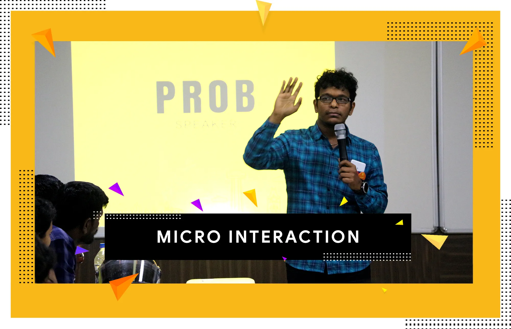
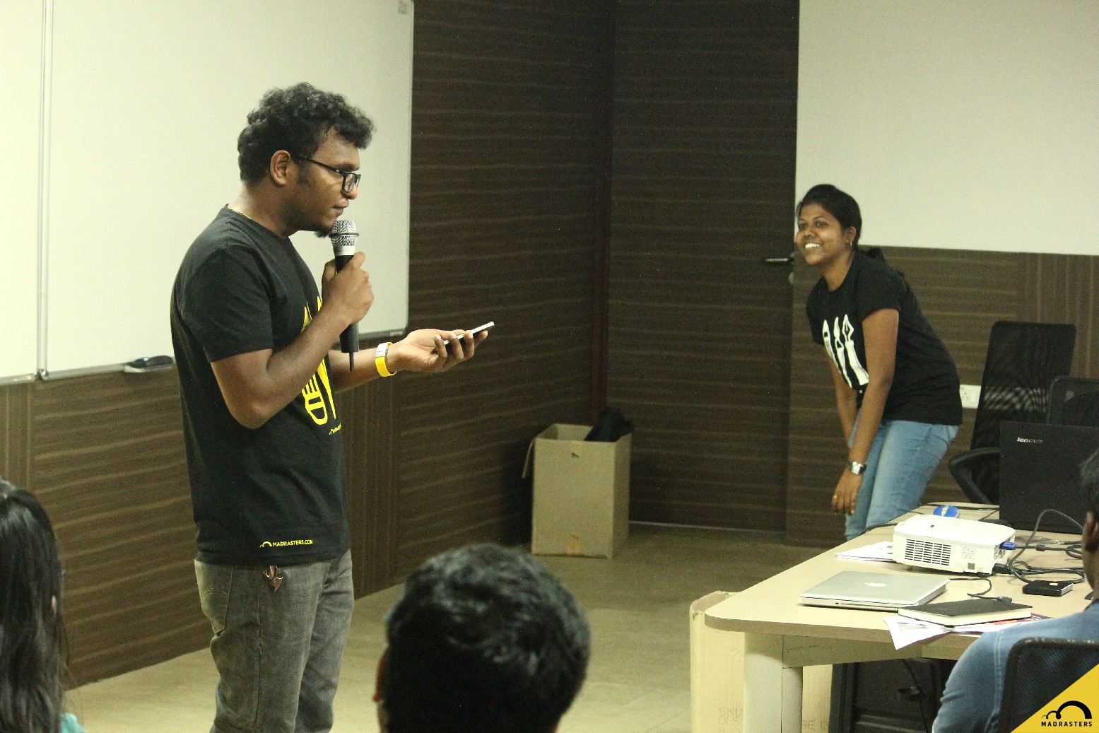
Talks, panel discussions, and academic research exploring design thinking, product development, and user experience.
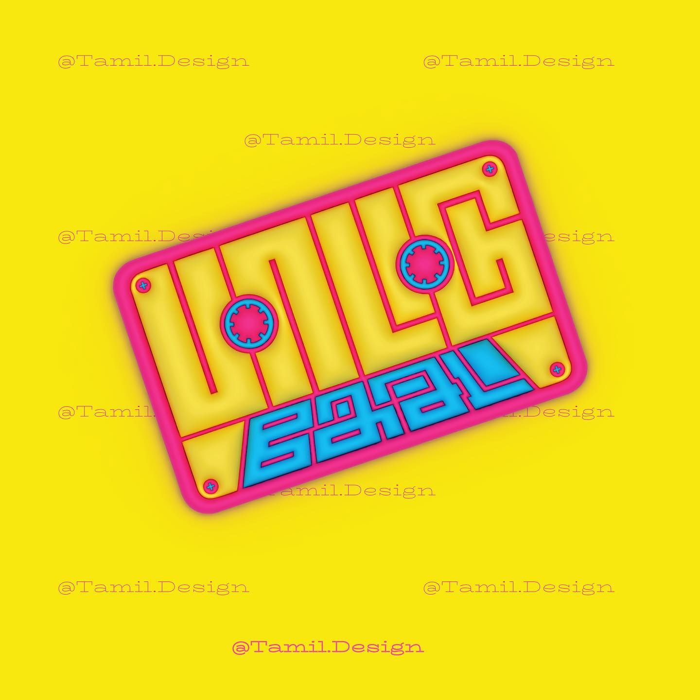
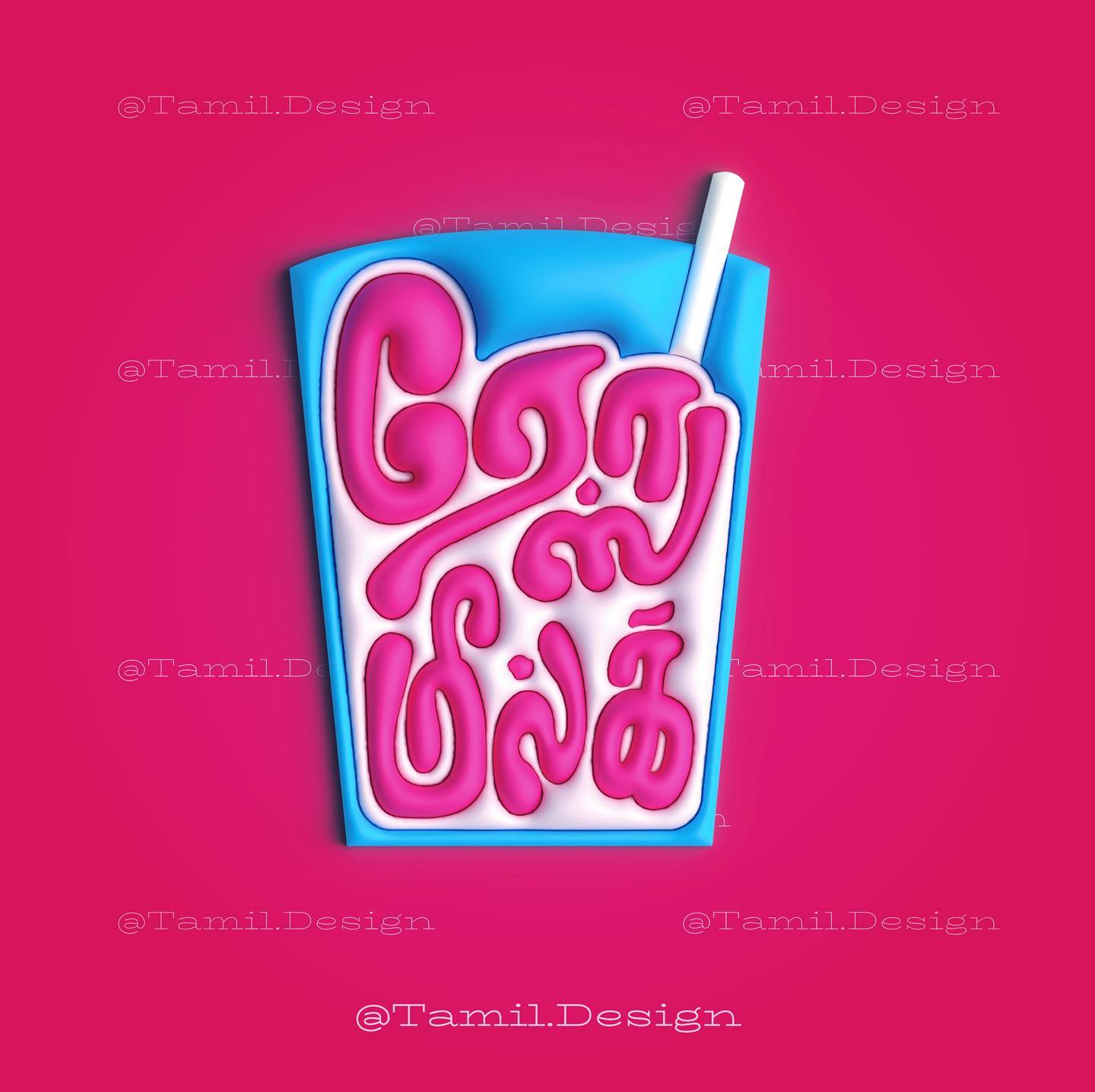
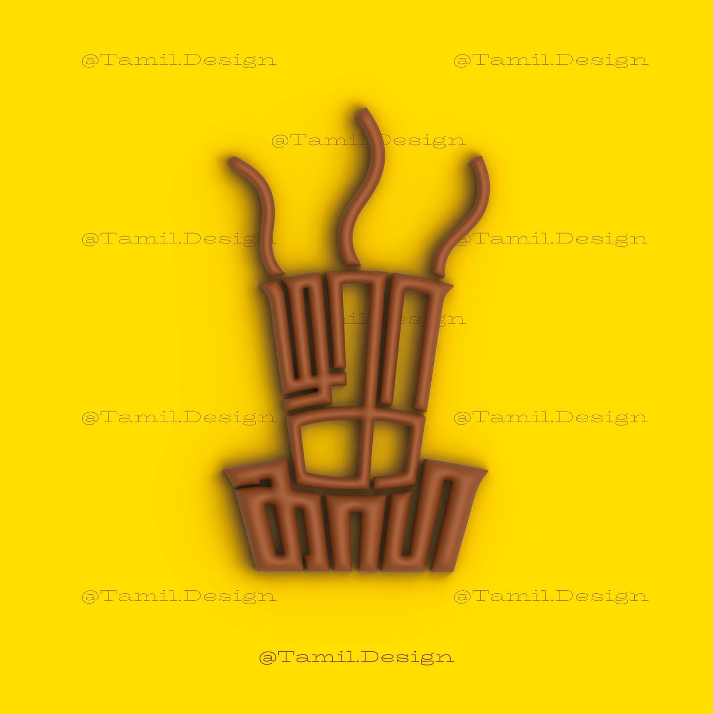
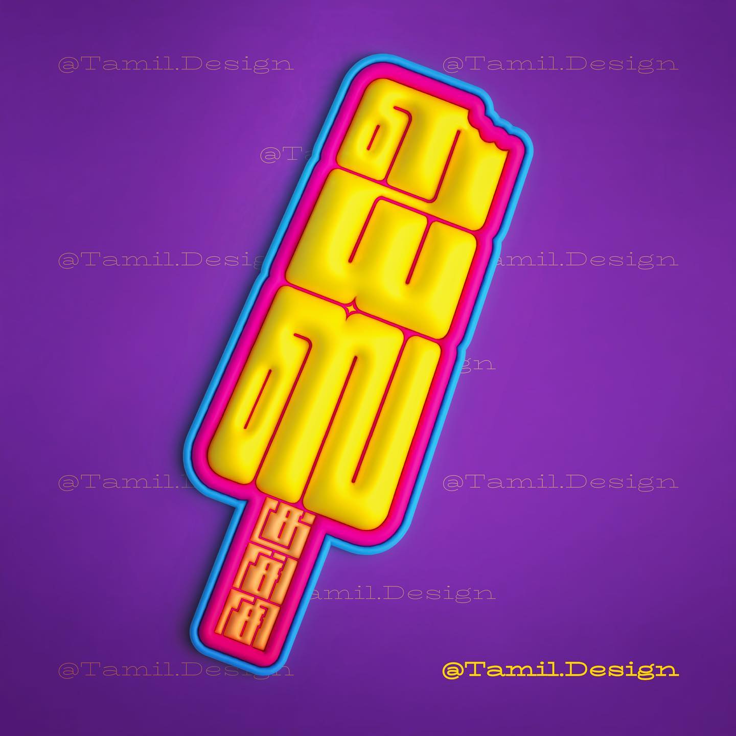
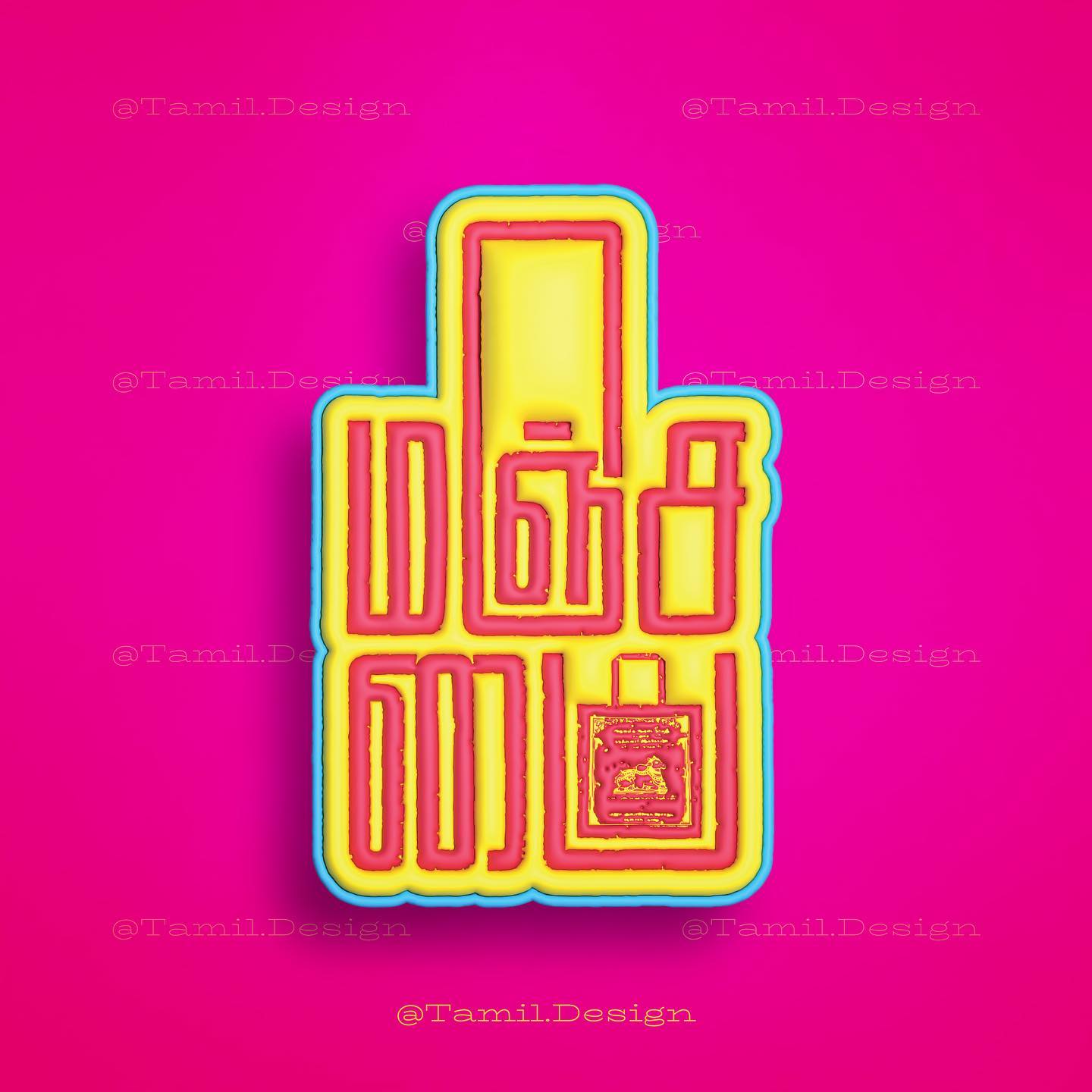
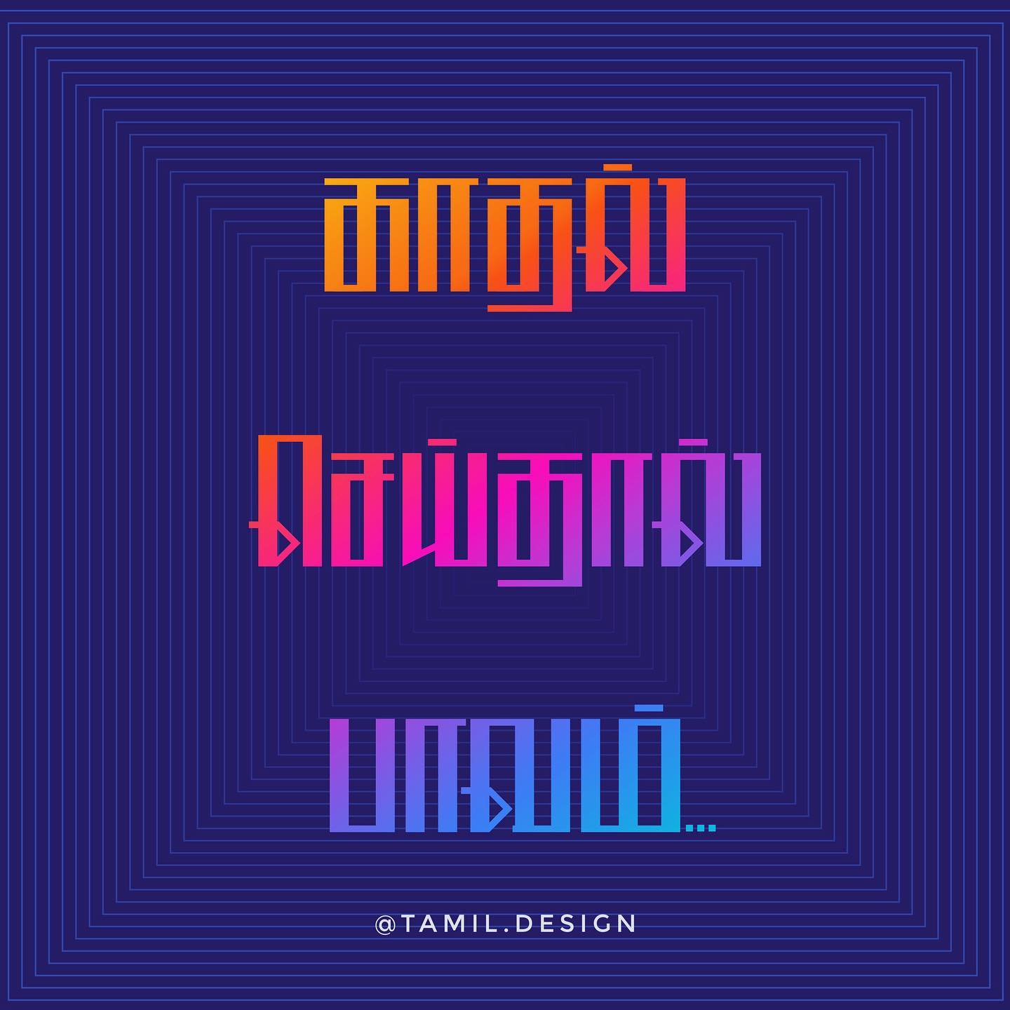
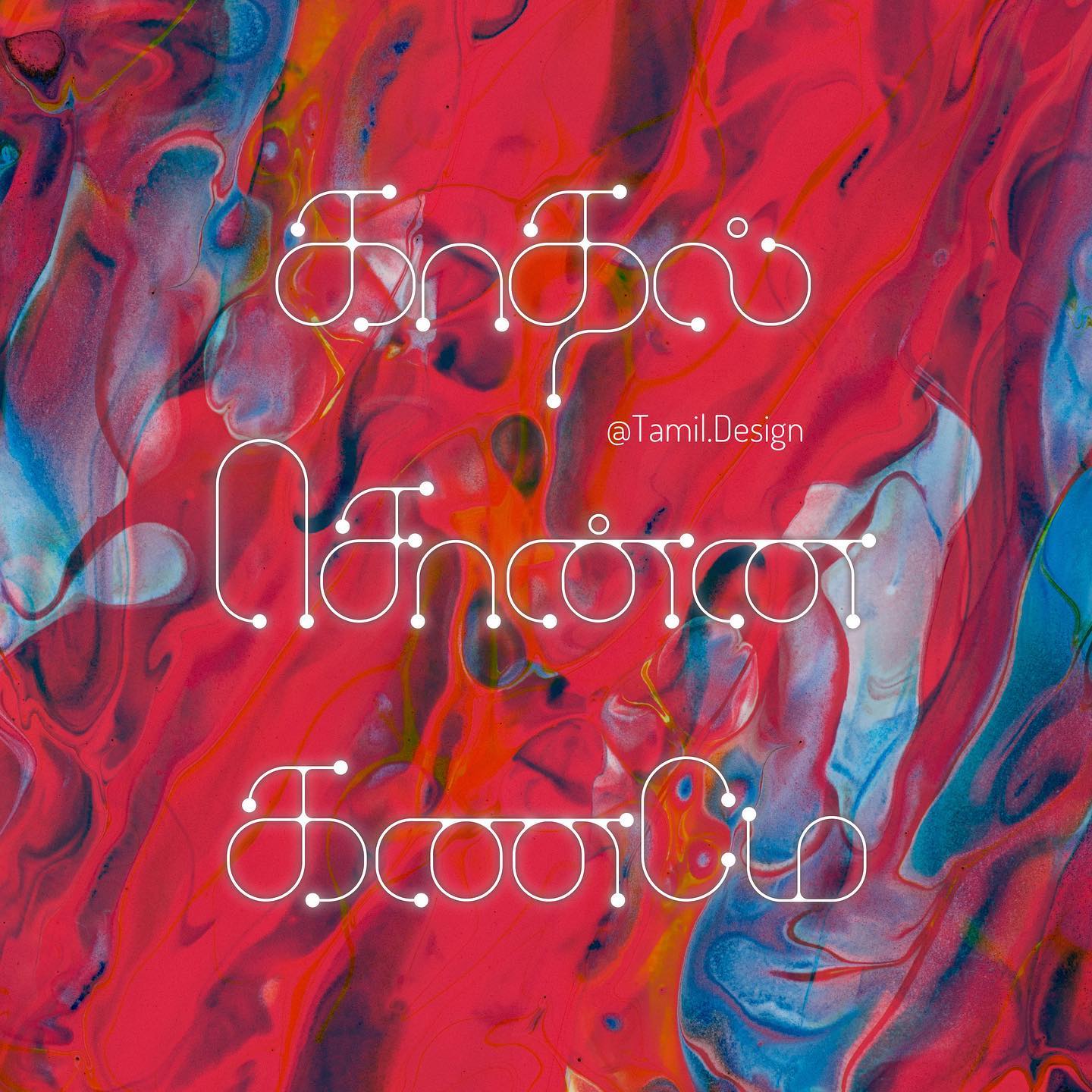
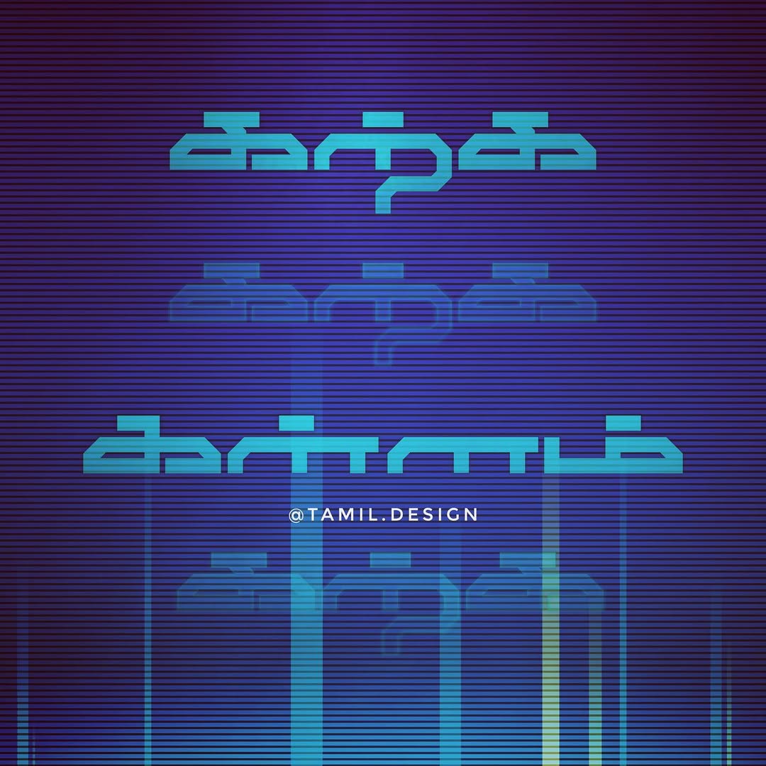
A collection of Tamil typography experiments blending traditional script with modern design aesthetics. Each piece is inspired by Tamil culture, music, cinema, and everyday life.
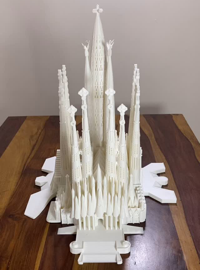
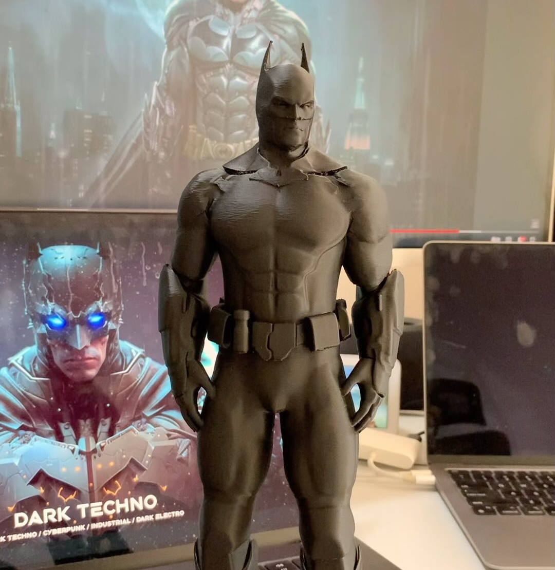
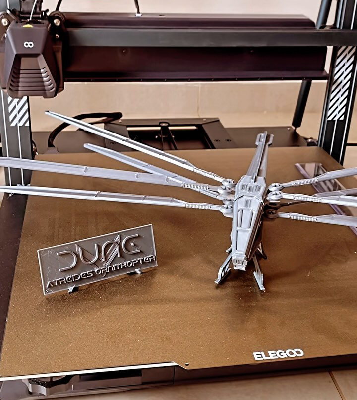
Exploring the world of 3D printing — from architectural models to pop-culture collectibles. Each project is designed, sliced, printed, and hand-finished.
A detailed 3D printed replica of Antoni Gaudí’s iconic basilica in Barcelona. Capturing the intricate Gothic and Art Nouveau forms that make this UNESCO World Heritage Site one of the most extraordinary buildings ever conceived.
A highly detailed Batman figurine with dramatic cape flow and textured suit details. Printed in multiple parts and assembled with careful post-processing including sanding, priming, and hand-painting.
The iconic dragonfly-inspired aircraft from Frank Herbert’s Dune universe. Features articulated wings that can fold, detailed cockpit, and surface texturing faithful to the Villeneuve film design.